
 < previous
 next >
Goal of the Project
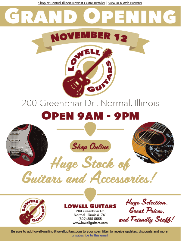
For the WGD 205 Advanced Design and Rapid Visualization course at DeVry University in 2017, students were tasked with creating a creative brief and several brand identity graphic design pieces for a fictional business. I chose to create a logo, a Grand Opening email blast and a print magazine advertisement for a fictional guitar retail store called "Lowell Guitars". The audience for these designs was determined to be guitarists and aspiring guitarist of all age ranges, primarily young adults through a more experienced guitarist.
Project Specs
Category
- Branding
- Logo Design
- Page Layout
Software Used
(click icon to view name)
Audience
- Beginner Guitarists
- Intermediate Guitarists
- Experienced Guitarists
Company Style Guide
A quick one page reference for the company logo, colors, typefaces, and information.
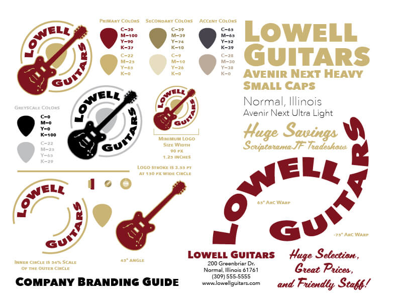
Lowell Guitars Company Style Guide
Business Collateral Design
In addition to the designs displayed above a business card and letterhead design was created for this business. Using the Company Branding Guide, the logo, colors, typeface were all kept consistent with other business designs.
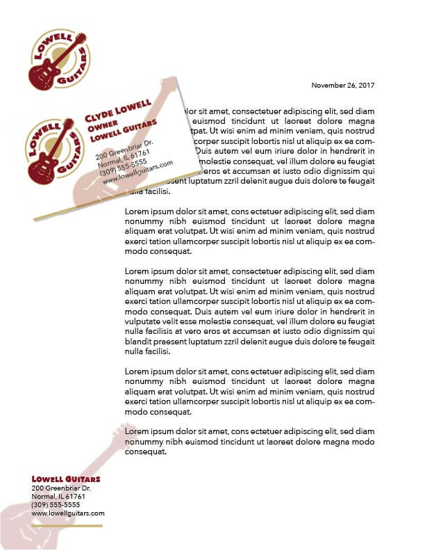
Business Card and Letterhead Design