Solution to the Problem
This infographic was quite fun to assemble despite being a potentially dry subject. Search Engine Optimization isn't exactly the most exciting of subjects, however doing some basic brainstorming and trying to bring a dry subject to life added an extra challenge to this design work. I settled on the design motif of playing off the wording of "mystery" by introducing the concept using UFOs repeated throughout the design. The color scheme also invokes this mysterious quality using a series of gray, black, white, along with saturated green and violet colors. The long form design lends itself to the design being displayed on the web (rather than being a print infographic). Overall I was very satisfied with the final deliverable design.
Clicking the design below will load the Adobe PDF version of this SEO infographic.
To view Adobe PDF files on this webpage please download the Adobe Acrobat Reader.


Feedback from Others
"Thomas, Another impressive example as I'm glad to see you jump start the discussion with another great narration of your process and overall composition."
- Eva Hamburger, DeVry University Instructor (02/2018)
"Great Job Thomas, I like how implemented a storyline factor into your infographic and colors and direction all align into a smooth infographic."
- David Oommen, DeVry University Student (02/2018)
Video Text Transcription
(Tom Corcoran, narrator speaking)
Hi everyone,
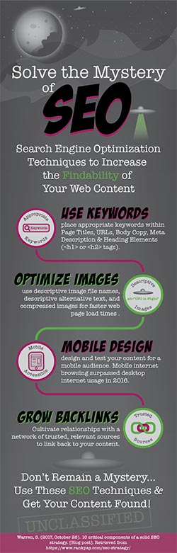
For my week 6 infographic of Search Engine Optimization Techniques I decided to go with a tall infographic format. This design is 800 pixels wide by 2500 pixels tall which would be more well suited to delivery or presentation on the web rather than being a printed piece. The theme for the design came about by brainstorming how SEO techniques allow content that would otherwise exist but go hidden or undiscovered to become “findable” content for a search engine. This lead me to think about the word “mystery” and then eventually I settled on this sort of UFO design to go with the mystery element.
This design uses 2 colors: a green and a reddish, violet color which are complementary colors as they are opposites on the color wheel plus several shades of gray in the background, and black and white text.
As usual I designed these graphics in Adobe Illustrator and the moved them all over into InDesign to do the final page layout. The infographic starts with a compelling graphic of the moon, stars and sky in the upper portion to gain viewer interest. There is also a small UFO shown which is repeated throughout the design. Then the text “Solve the Mystery of SEO” is used for the title, which is the largest element on the page and SEO is really the focal point. Some introductory text follows describing what this infographic is about. I chose two typefaces for the design, one called American Typewriter for the body text and the headings and subheads generally have a typeface called Bada Boom. These two have about as much contrast built into them as possibly with one being very traditional typewriter style text and the other being much more comic book like.
I covered four of the SEO techniques I found from my research, Using Keywords, Optimizing Images, Designing for Mobile, and Cultivating Backlinks to your content. Each Subhead has a text description and a visual element corresponding to that topic. Rounded lines of alternating colors lead the viewers eye down to the next technique. This makes use of the continuity principle by leading the eye and the element of rhythm by alternating the colors from red/violet to green and back. This allows for easy navigation within the design leading the viewers eye from technique to technique.
Finally the design concludes with the closing text about following these techniques to get your content found. The source of the information comes last in a red/violet rectangle with white text.
I feel that I would need to spend more time on refining these graphics to go along with each technique to take advantage of the picture superiority effect but overall I am fairly pleased with the design. I think that it is rather eye catching and unique. And that it makes a possibly intimidating (and maybe rather boring, for some people) topic into something that is a bit more playful and more engaging.
Anyway… please let me know what you think about this design. I appreciate any comments or critique that you have. Thanks.
 < previous
 next >

%20Infographic%20design&via=thomas_corcoran)
%20Infographic%20design)
%20Infographic%20design&body=http://corcoranstudio.com/images/artifacts/mysteryofseo_infographicSM.jpg%20Corcoran%20Studio%20Search%20Engine%20Optimization%20(SEO)%20Infographic%20design%20by%20Tom%20Corcoran%20at%20corcoranstudio.com)