Goal of the Project

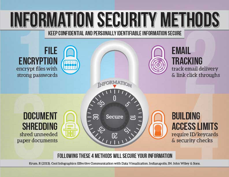
For the WGD 229 Information Design course at DeVry University in 2018, the topic of information security methods was discussed, researched, and finally displayed using an infographic design. The audience for this design is a general audience of computer users but is primarily geared toward owners of a business concerned with informing their employees about securing internal, organizational information. I can image this infographic being printed and displayed in employee break rooms or other high traffic locations at a business with its eye-catching colors and large, central graphic.

Project Specs

Category

  • Infographic
  • Page Layout

Software Used

  • Adobe Illustrator CC icon
  • Adobe InDesign CC icon

(click icon to view name)

Audience

  • Small or Large Businesses
  • Non Profit Organizations
  • Computer Users

Solution to the Problem

After researching and writing a paper on the topic of Information Security, an infographic detailing 4 major methods to keep confidential and personally identifiable information secure was created. This infographic was initially designed using Adobe Illustrator CC where I chose the fonts, layout and colors along with the drawing and creation of all of the graphics used in the design. After creating several possible layout sketches, I chose the “4-quadrant” layout seen in the infographic above. This layout separates out the information into 4 distinct areas using the principles of proximity and similarity to create an aesthetically pleasing and easy to read infographic design. The large combination lock graphic in the center of the design draws in the viewer’s eye using the principle of proportion or scale. This infographic layout and graphic elements were all finalized in Adobe InDesign CC.

Feedback From Others

"Thomas, as usual, you did an excellent job on this week’s iLab, where we explore security of information and present within an appropriate information structures... Your infographic illustrated effectively the topic using a quadrant with different subtle color choices corresponding to the lock icons and I can see each lock's internal image corresponds to the theme of that quadrant. The strong and simple sans serif font helps establish clear messages and I see you aligned the introduction on the top in a balanced manner to span across both sides effectively. A lot of good thought has been put in so far and I look forward to seeing your work as we continue next week."

- Eva Hamburger, DeVry University Instructor (2/2018)

"Hi Tom, great design.... I think your design owns the 5 second rule. A quick glance and you really get a grasp of the key points. I love the way you used color to add contrast and separation for each key point, but then used the locks to create similarity and tie everything back together."

- Nicole Kennedy, DeVry University Student (2/2018)