Goal of the Project

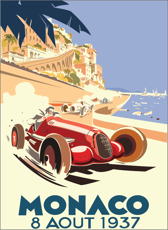
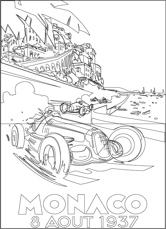
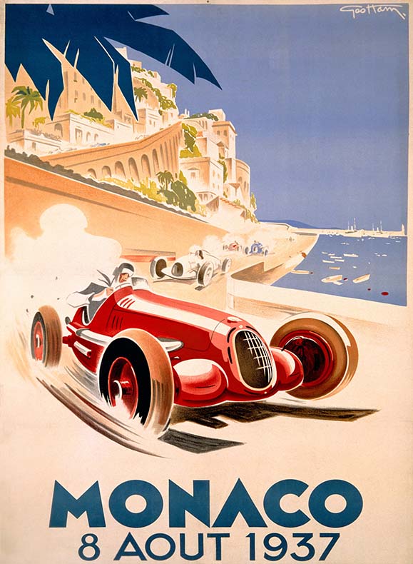
During the WGD 201 Visual Design Fundamentals course at DeVry University in 2017, students were given a project to recreate a famous piece of artwork or poster using Adobe Illustrator. The video above is a screen recording of my thoughts on my graphic design process to create this Art Deco Auto Racing poster from the 1930s.

Project Specs

Category

  • Illustration

Software Used

  • Adobe Illustrator CC icon

Adobe Illustrator CC

Audience

  • Peer review for fellow graphic design students to see my process for recreating artwork using the pen tool, vector shapes and variety of other tools within Adobe Illustrator.

Solution to the Problem

As stated in the video above, I followed a basic process for recreating the artwork by placing each element onto a separate layer, naming the layers appropriately for ease of use, and using the various drawing tools within Adobe Illustrator to recreate this poster. I'm quite pleased with the finished product and enjoyed recreating each detail of this artwork.

Clicking the design below will load the final Illustrator version of this artwork recreation.

Monaco Auto Race Art Deco Poster Recreation

Adobe Illustrator Poster Recreation

Monaco Auto Race Art Deco Poster Recreation Lines Only View

Adobe Illustrator Poster Recreation Lines Only View

The original artwork by Geo Ham can be seen at AllPosters.com.

Feedback from Others

"Wow! My skills on Illustrator are just beginner but I am so impressed by your take in this piece of art... shows me how much we can do with Illustrator and your technique with doing the detailing a little different."

- Jasmin Rodriguez, DeVry University Student (9/2017)

"Thomas, your version looks just like the original. You are very experienced using AI. You even have all the shadows and font the same. You did a great job!"

- Dakari Davis, DeVry University Student (9/2017)

Video Text Transcription

(Tom Corcoran, narrator speaking)
Hi everyone.
I decided to recreate an art deco painting from the 1930s of a Monaco car race. I've always liked this style of poster/paintings but I have never tried to recreate this style of work. It conveys interesting motion for a still image and has a very clean style and a balanced composition even though it is rather asymmetrical. The large red car is clearly the focal point and the words Monaco and the date of the race.

To perform this work I placed the original on the background layer and locked this layer. I then proceeded to break the work down into it's separate components to tackle one piece at a time. I originally started with the obvious organic yet simple and large shapes like the navy blue palm tree in the upper left and the water shape in the middle right. Most of this work was done using the pen tool. I also used the pen tool to recreate the type as I wasn't sure if I had a sans serif typeface close enough to the original from this painting. Since the type was very simple and sans serif it was easy to recreate using the pen tool. Once I was finished with those I started on large outlines of areas with a solid color. The first area I chose was the buildings outline in the upper left. Then I could color in that area with the light tan color using the eye dropper tool on the original to match the color. At one point early on in this process I chose to work on separate layers for the separate components of this drawing. That allowed me to turn off and on the layer to see if what I was drawing matched up fairly closely with the original. Occasionally I would run into an geometric shape like a rectangle or a oval/circle shape and I used those tool in Illustrator when appropriate instead of solely relying on the pen and/or pencil tool. When I came to some of the smaller detail like dust being kicked up by a car in the far background I simply used the pencil tool with the mouse and created a jagged shape or line to represent that element.

This art work took me something like 7 hours to recreate. Originally I didn't think it would take quite that long but I tend to be a bit of a perfectionist when it comes to my work. I would work on a little bit and if I got tired of that area of the painting I would either take a break and get back to it or switch to a different area and work on that for a bit.

I didn't try to recreate every paint stroke or even some gradient effects. However, overall I am pretty happy with the way it came out.